Park Street Library Catalog is a website to help users find a book to check out at the library.
This project focuses primarily on applying UI principles, composition, and visual design to create a responsible website.
Duration: 2 weeks
Tool: Figma
Color Palette
I decided to choose blue as the main color palette for this website. According to color psychology in marketing blue symbolizes trust, dependability, and stability.
Typography
I chose Inter as the website’s font for its simple and clear feel. A diverse range of people go to the library so I wanted to make sure the font was simple and easy to read.
UI Elements
A variety of UI elements were utilized to create a cohesive website. I also created a UI kit to maintain the consistency between the pages and responsive websites.
Home page
On this page the user can log in, search for a specific book, or browse through what’s popular, what’s new, and genres.
I started my designs on a desktop because library catalogs are most often accessed using a computer. However, I wanted to make sure the website was responsive to a variety of screen sizes to ensure usability and satisfaction.
Search Results Page
This page shows different library materials that are connected with what the user searched.
The user can also use the check boxes in the filter search or the advance search option to narrow down their results.
Book Information
This page shows the specific details about a book. The author and subjects are linked so that the user can easily browse similar options.
Browse by Format or Genre
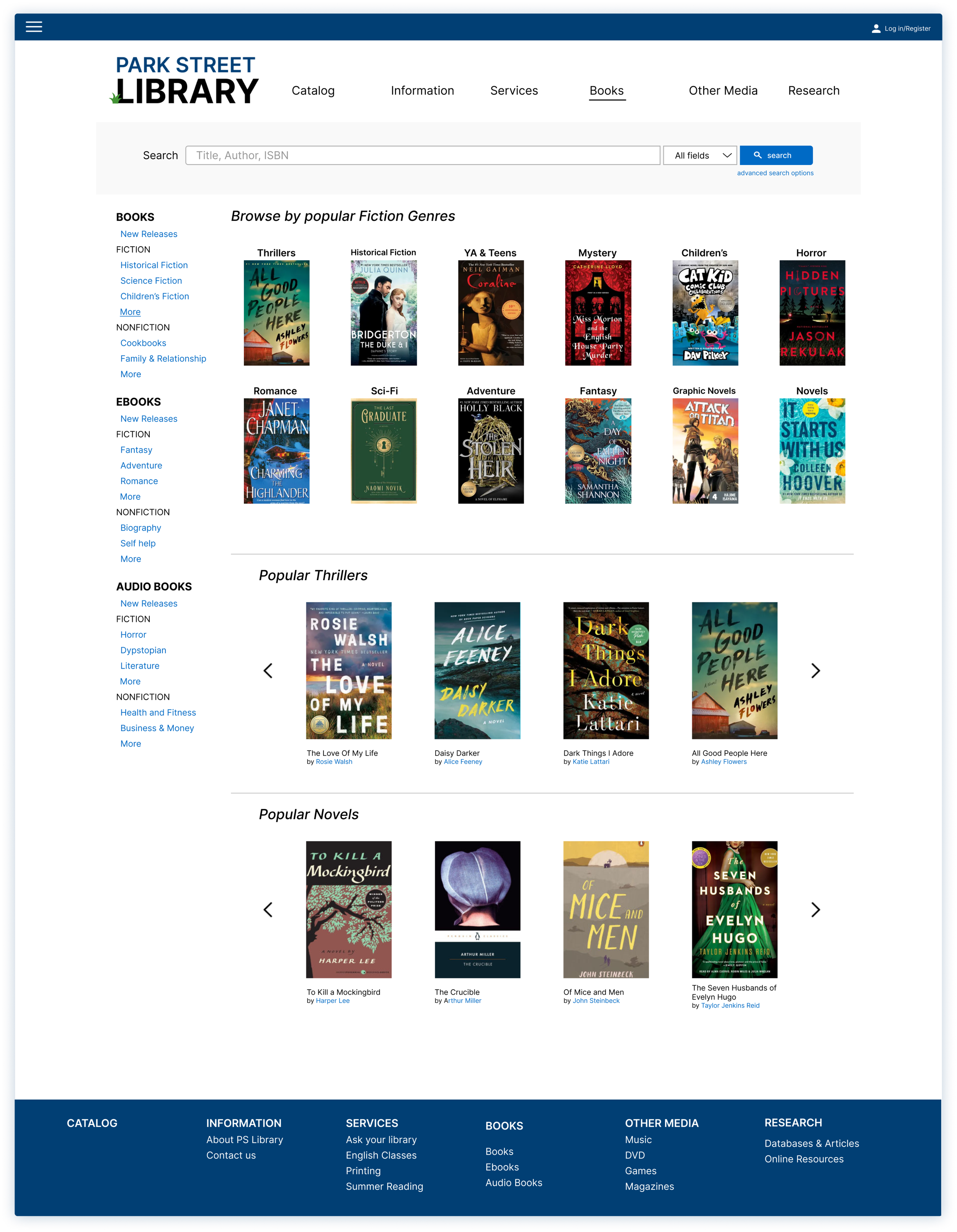
If the user does not have a specific book in mind, they can click into the Books page. From here, the user can choose to browse by format (book, ebook, audio book) or they can browse by genre.
All three designs have a carousel to allow the user to browse through different books to check out.
The desktop design uses clickable arrows to navigate through the carousel while the table and mobile designs use a swiping motion.
A hamburger menu is used to help the users navigate through the library catalog website. Within the hamburger menu, an accordion is also utilized to save space (especially for the tablet and mobile version) and also provide further associated content.
Due to the smaller screen size the filter search is not seen on the screen on the mobile version. However, users can use the advanced search options to further narrow their search.
I decided to use rows and columns to organize the book’s information. This allows for the content to adjust accordingly when the screen is resized.


