
Beehive Student Portfolio Application
Summary
For years, standardized tests have been used to measure students’ academic progress. However, this single, end of the year test often time fails to take into consideration the diverse experiences, backgrounds, and strengths that all students possess. Many school districts and educators are looking into using portfolios as a more equitable way to show students’ growth and learning.
With the increase of technology use in the classroom, Beehive aims to provide a space where teachers can help K-12 students digitally document and save their assignments and projects to showcase their academic growth.
Problem
There is a need for a portfolio application that teachers can use with their students to help them store and collect their work. However, due to confusing and inefficient interfaces on many educational applications, teachers have a challenging time finding and using a tool with their students.
Solution
Design an application to help teachers and students create a digital portfolio to showcase academic growth.
Role
UX/UI Designer
Tools
Figma, Adobe Photoshop
Duration
4 weeks
RESEARCH
Research questions to get me started:
Methodology
I reached out to people who have had 1+ years teaching K-6 students in a public school.
5 elementary school teachers ranging from ages 24-56 were interviewed
User interviews were conducted to have an in-depth knowledge of the teacher and their experiences
After conducting the interviews, the responses were written onto sticky notes and sorted into overarching trends and similarities.
Competitive Analysis
I analyzed 3 EdTech applications to get a sense of the key features, icons, and navigational tools they were using. I learned that although there are many educational technologies out there, very few provide portfolio services specifically to K-12 students and teacher.

Key Findings
After sorting through the sticky notes, I noticed there were reoccurring challenges and pain points mentioned throughout the responses. I used these main challenges to help shape the design and framework of my project.
Challenge 2
Many platforms they use have a clunky and inefficient interface.
Challenge 1
Teachers have limited time to teach themselves and their students new technology.
Challenge 3
The technology needs to be accessible to a diverse range of student abilities and levels.
DEFINE
Problem Statement
I am a teacher trying to build a digital collection of student work, however, many current applications are challenging to use, have inefficient interfaces, and are inaccessible to all students. If only I had an application that is intuitive and easy to use, efficient and organized, and accessible to all students.
User Persona
Based on the research, a user persona was created to better understand and empathize with how the user may interact with and experience the app.


Who are the users?
What are current challenges and pain points with educational technology?
What are current challenges and pain points with creating student portfolios?
IDEATE
Information architecture was utilized to create a site map to show how the application would be organized and how users would navigate.
Site Map

I responded to the 3 challenges discovered during user research with 3 solutions.
Initial Designs

Solution 1: Easy to learn and use
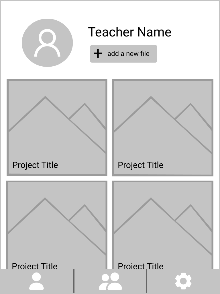
I designed only 3 main pages: the Teacher Profile, Class Page, and Settings.
These 3 pages will help teachers be able to achieve their goal of helping students upload their work.

Solution 2: Quick and easy navigation
I used a bottom navigation bar so that students and teachers can clearly see their options and know where they are in the application.

Solution 3: Accessible to all students:
I created the option for teachers to post projects so that even the youngest learners can be supported by allowing the teacher to do the heavy lifting (typing in the description, creating a title) while the student can focus on uploading their work.
This allows the teachers to post projects and activities as a way to give their students ideas and suggestions on what they could post.
Why an iPad? All of the teachers I interviewed have K-6 students, and they shared how there is an increased use of iPads within the classroom national-wide due to their faster log in speed, students can move around while using them, and have a more simple operating system (as compared to laptops and desktops).
PROTOTYPING
& TESTING
Usability Tests
I reached out to 3 current teachers for a moderated usability test. I prompted teachers to complete 2 user tasks- first, post a new project and second, approve a student’s post.
I utilized 2 KPIs during the usability test: Task success rate and Misclick rate
I took the feedback from this usability test and prioritized 4 issues to be fixed in the next iteration
1. Utilize a hamburger menu to support clearer navigation


Before: Confusing navigation for teachers with multiple classes. Teachers can only navigate between their classes using the middle icon.
After: I used a hamburger bar to stream line the navigation process. Now teachers can select the class they want to focus on and be able to navigate through the projects, notifications, and students directly.
2. Updates to bottom navigation bar and icons

Before: During the usability testing, all 3 teachers had to ask me clarifying questions about where to find the notifications (as it was embedded in the class rosters page).

After: I created a notification icon separate from students. I also changes the icons to be more easily identifiable and added labels to provide clarity.

3. Teacher Page to Projects Page
Before: Teachers didn’t have information regarding the status of their projects.

After: Teachers wanted the profile page to have information about their assignments (date, number of students who posted, etc). I changed it to be a “Projects” page where teachers can go to manage and monitor different posts.
4. Changes to the Create New Project feature
Before: Teachers could only upload one at a time and wanted to be able to make the same post for multiple classes.
The buttons were too close and caused misclicks.

After: I added a “Post to” multiple classes feature. This way, teachers can save time by easily making the same post to multiple classes.
To address the mis-clicks, I changed the location of the “Post” button to the top right corner.
Lastly, I used Placeholders inside the text boxes instead of having labels. This helps clarify the content that goes in the text box by prompting teachers what to write.
THE FINAL PRODUCT
I brainstormed different branding ideas and ultimately decided to move forward with The Beehive. Bees have a strong work ethic and symbolize hard work while beehives are related to the idea of community and connection.
I went with an orange color theme to create a feeling of optimism and enthusiasm amongst the users and viewers of the application.
I used a San Serif font to help with readability. Sometimes younger students have a challenging time reading Serif fonts because they look different than the letter formations they are taught in that grade level.
Branding

After doing some additional research on accessibility in design, I made design changes based off of my research on accessibility in design in order to meet WCAG requirements.
Accessibility
Hi- fidelity Prototype
Using the feedback received during the first usability test, I made design changes on Figma and created a hi-fidelity prototype of the application. In this iteration, I focused on ensuring that the application is simple/efficient to use and that it provides students data to teachers in a way thats quick and easy to read.

RESTROSPECTIVE
The scope of this project focused primarily on the teacher’s experience using the application. Moving forward, I would like to consider the perspective and journey of different users, like the students or the parents. I would want to learn more about how students interact with technology, what motivates them, what challenges them, and how to keep them engaged.
Next Steps
1. Use data, not assumptions: As a former teacher, I had my own assumptions and ideas going into the research, however I learned so many new insights that I would have never thought of. I realized how important it is to use data from research and tests to drive my design decisions.
2. Change is ok!! Testing and iterations may require big changes to designs and initial wireframes. I learned to be open minded to changes, especially regarding my designs.
What I Learned